
One of the first things I did when I was ready to get serious about blogging was consider branding, including the investment of beautiful fonts.
I am not a graphic designer, so at the very least, I knew I needed to have a distinct font instead of the free ones you see so overused.
Note: This post contains affiliate links.
I knew that if I wasn’t going to pay for a professionally made logo, a good font was the minimum requirement to distinguish my brand among thousands of others.
Now it might be safe to say that I’m a font lover, and if I had the money, I’d be buying and downloading tons of beautiful fonts. But not only is that bad for the wallet, it’s bad for branding.
Now, not only am I not a graphic designer, but I am not a branding expert.
I’m self-taught, but I do know a few things. Even if you lack graphic and web design skills, you can build a brand. The more you stand out the better, and the more consistent you are with your brand elements, the better.
Your fonts, colors, writing style, social media style, and basically everything else you use in your blogging efforts help to define you in the blogging world.
In order to become “well known” you need to be easily recognized, and that includes your visual presence.
It’s safe to say that it’s an area that I need to work on, and plan on investing more of my time and money on as time goes on. However, for now, I can at least help my growth along with the use of a pretty, distinct font.
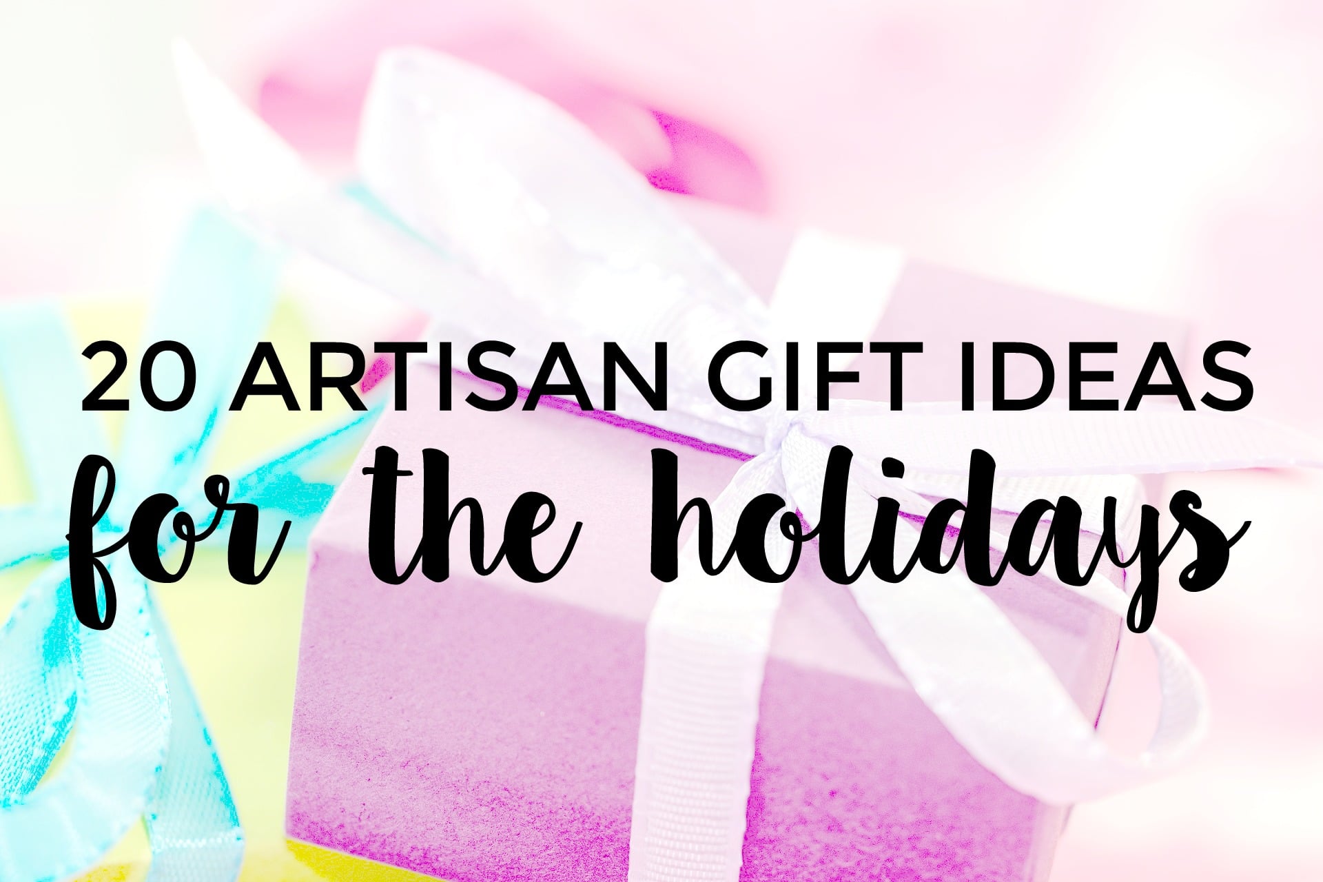
Right now I am playing with the Jasmine (from Creative Market) + Clementine (from Etsy) fonts and even though I can’t really choose between the two yet, I’m loving the way my Pins are standing out so far. (They are both just beautiful fonts! I can’t choose!)
Out of every use a beautiful font serves, I am seeing the biggest results when I create Pins. My Pins that have a nice, bold script font are performing really well and I have finally started to feel like my brand (including my Pins) is standing out a bit more. (You can read about how to make amazing Pins with PicMonkey in this post.)
Because I’m not a blogger that has some super quirky online presence, and I don’t use click-bait titles and funky photography, I have to work a little bit more to make sure that I’m not overlooked as a blogger.
Some of us struggle to find a blogging “voice” that is true to who we are in “real” life, and because of that, we have to focus on super high-quality content and images, among many other things.
It took me a long time just to figure out how to make great blog graphics, and I truly believe that a good font investment is what really helps take things to the next level when you’re a beginner.
I totally wish that I’d made the investment in a good font a lot sooner, because really, spending a few bucks on a font makes a huge difference. (Most fonts can be bought for anywhere from about $5-30.)
I’ll admit, however, that choosing from among thousands of beautiful fonts can be hard. It’s fun to shop for fun fonts that would be great to have for personal use, but you also have to consider your brand and the overall attitude you want your brand to have.
Here are few tips for choosing the perfect font for your blog:
- Focus on legibility. If you are picking between brush + handmade fonts, you still need to make sure that readers can easily make out each letter. This might mean that you choose a bold font over a frilly, thin font. Considering that most readers are on mobile devices, legibility is one of the most important things to focus on.
- Simple is usually better. Think about big brands – even everyday brands. Most often, they have super simple logos and lettering. You don’t need to have big and extravagant in order to be distinct.
- When you’re creating images, writing blog posts, and designing other graphics (like your logo), you probably don’t want to use more than two fonts. The fonts that you choose should be contrasting, so you should choose your pairings carefully. For example, I use one simple, easy to read Sans font mixed with my pretty brush font on almost every image I create. My blog header doesn’t feature a tagline at this time, but if it did, I’d use a simple font for it. Why? It helps make the important words stand out visually. If you want to read more about font pairing, check out Canva’s article on the subject.
- Your font has the ability to reflect your personal + blog style and attitude. In my mind, my blog is fairly simple and “no fuss.” That means that I’m not necessarily here to entertain, rather, I want to help people and be practical. Other bloggers use every bit of branding to show their sophistication, their quirkiness, their humor, etc. When you choose a font, it CAN say a lot about your brand. Don’t believe me? There’s a whole article about “Font Psychology” here.
- Be sure that the font you choose has the correct license. If you’re planning on using your font on your blog, your font needs a license that allows you to sell things. Be safe and get a font with a commercial license so that you are able sell things that feature that font. Even if you aren’t doing courses or ebooks now, you may want to in the future. (Licensing information will be available for each download you find.)
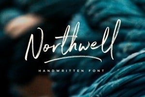
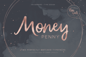
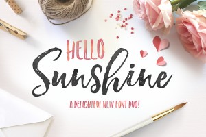
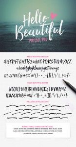
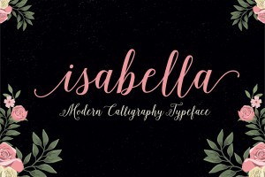
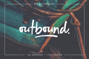
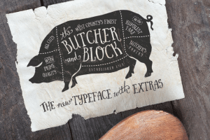
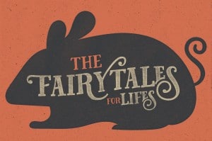
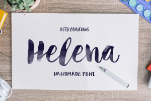
Now that you have a few pointers, here are some beautiful fonts to check out for yourself:
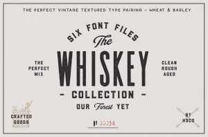
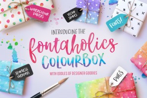
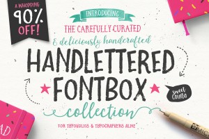
Also check out some font bundles:
Looking for something else check out thousands of other fonts at Creative Market!
Happy blogging!


Leave A Comment